Purchase on eBay
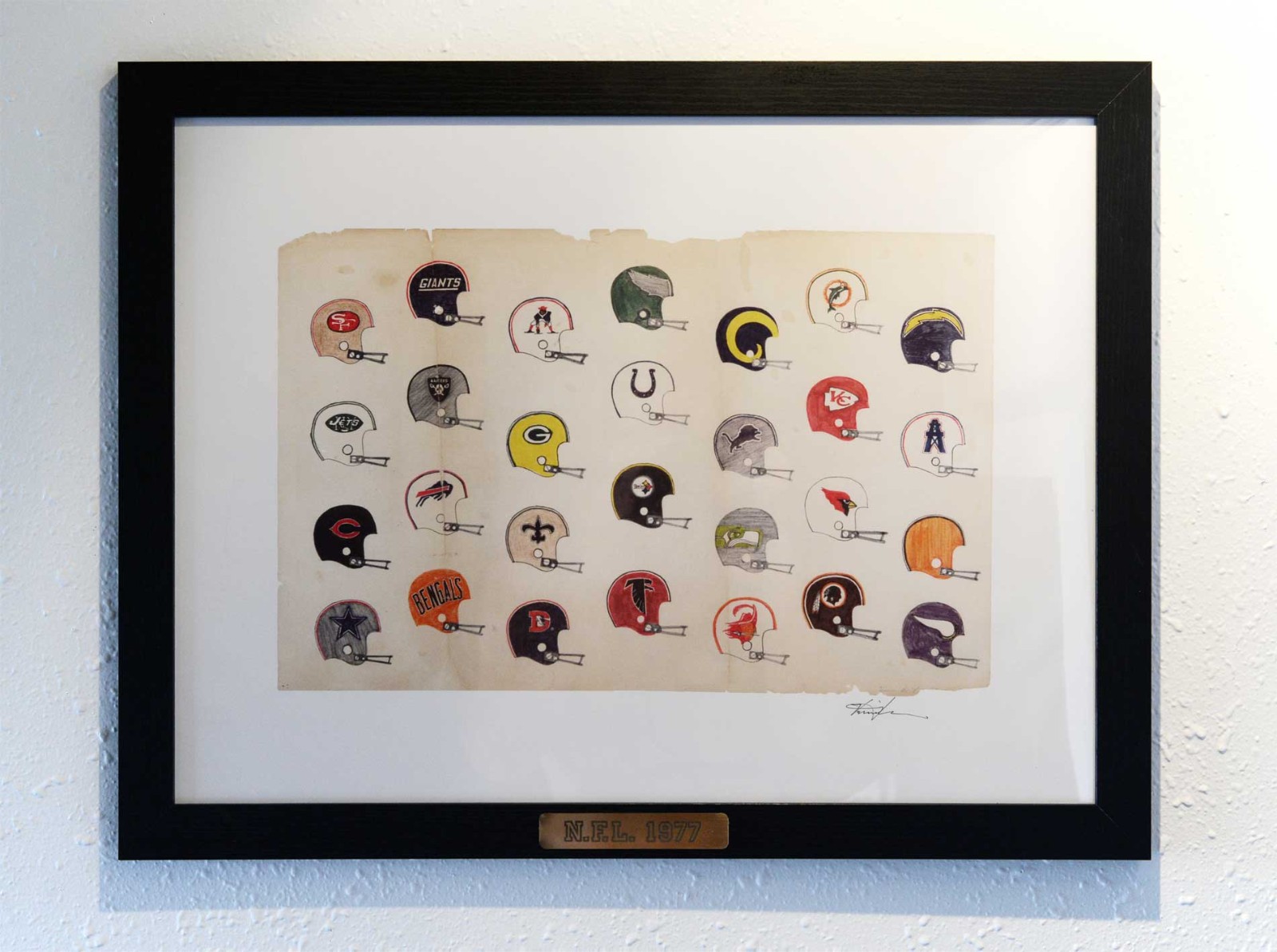
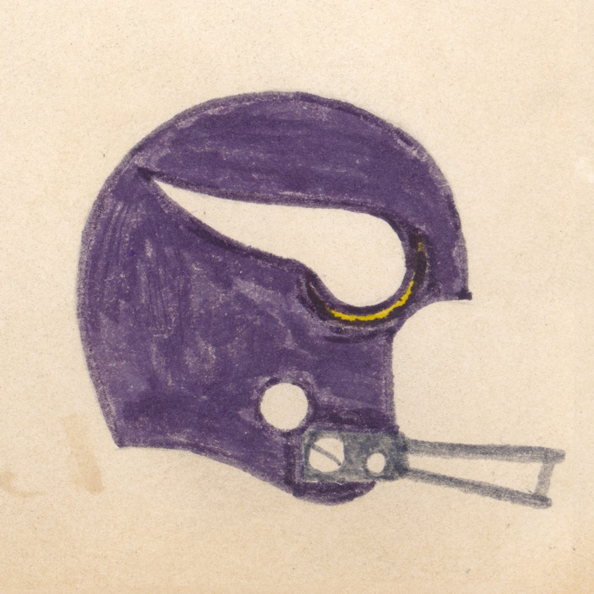
In 1977 I was 16 years old and huge fan of the N.F.L. My favorite teams were my hometown Chargers (right before the Dan Fouts, John Jefferson, Chuck Muncie era) and the Minnesota Vikings during the heyday of the Fran Tarkenton, Chuck Foreman, and Purple People Eaters era. I was almost in tears when those &#%$@ Oakland Raiders beat the Vikings in the '77 Super Bowl, but within a couple of years my Chargers were the talk of the town, and oh what glorious years those were!
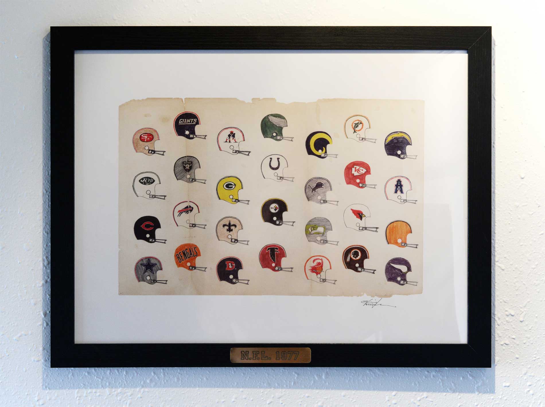
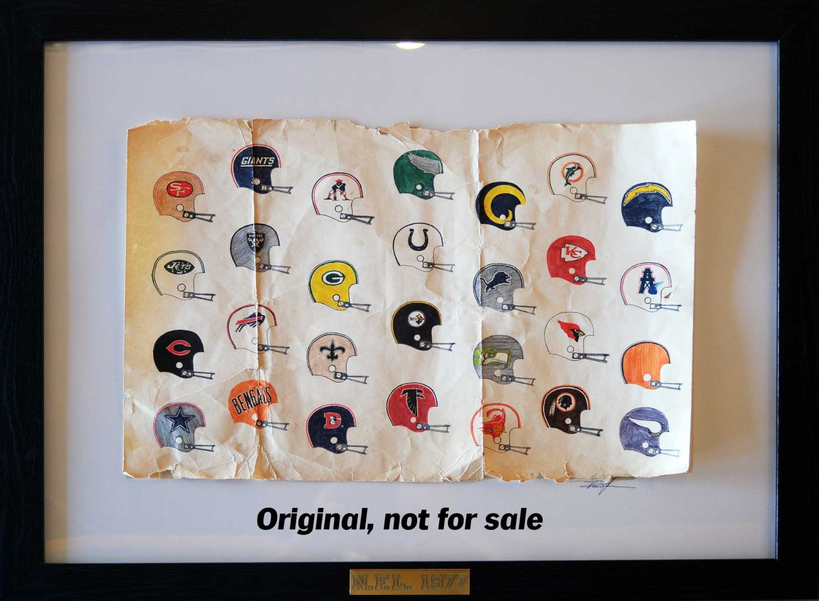
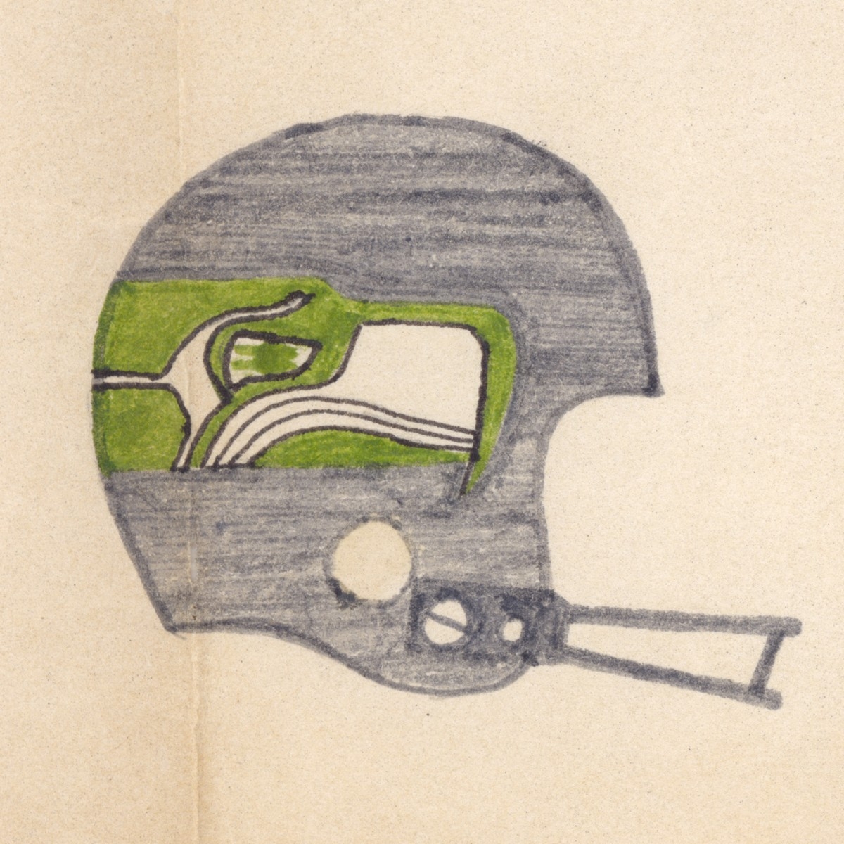
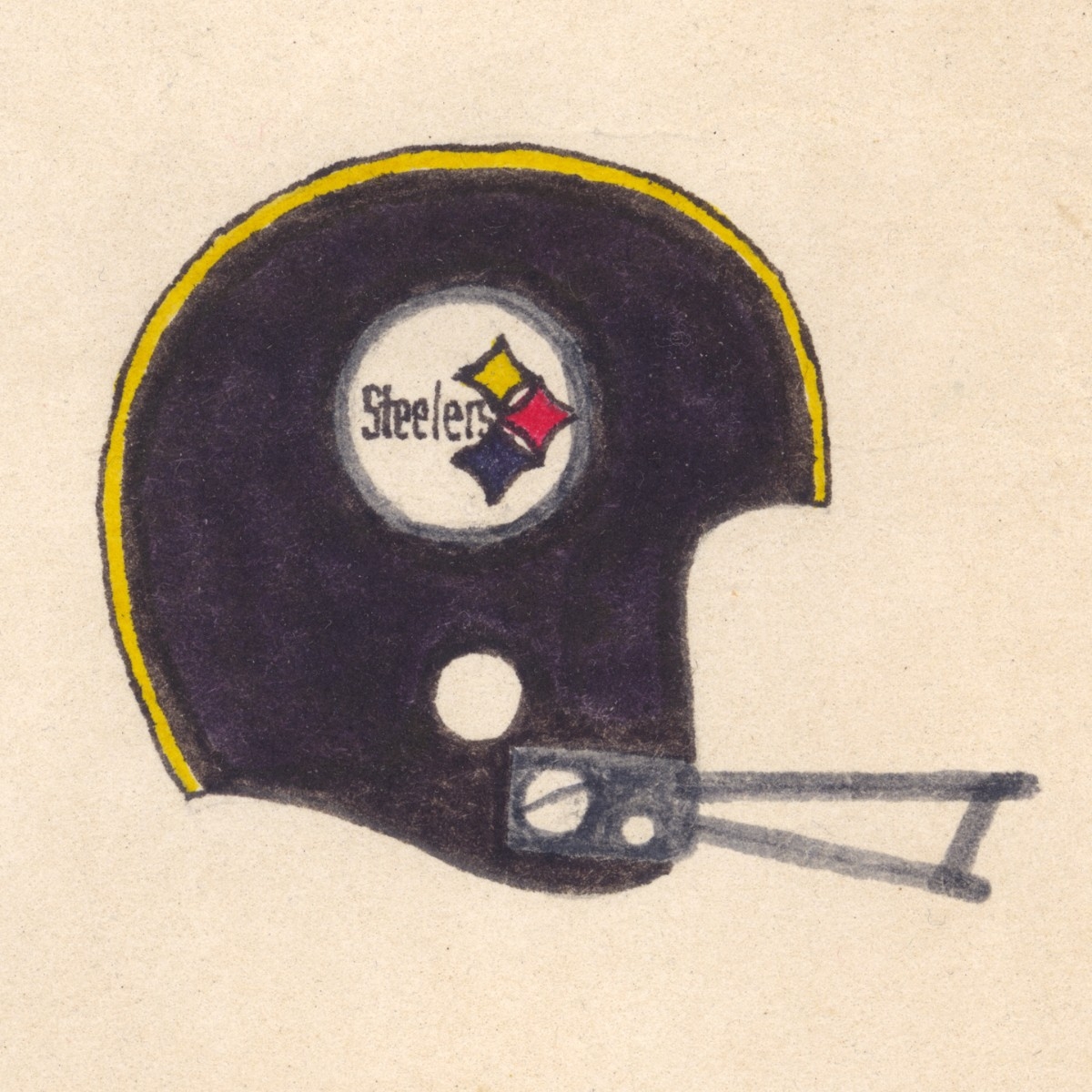
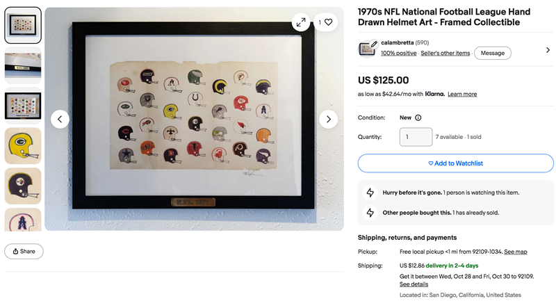
One of my favorite hobbies was drawing, and I recall doing this layout of all of the teams' helmets the very year the Seattle Seahawks and Tampa Bay Buccaneers joined the league. I did it 100% freehand, with no pencil sketches or guidelines and no templates, just a steady hand a keen eye for details. I don't recall exactly how long it took me, but I'm pretty sure it was weeks on end. I recall some of the more detailed ones being a real challenge to say the least, especially if they had fine details in white. This required being very accurate with whatever color was bordering the white area.
The teams in bold have never changed their primary helmets at all since I drew this, at least as far as I can recall. Back then the teams were:
- San Francisco 49ers
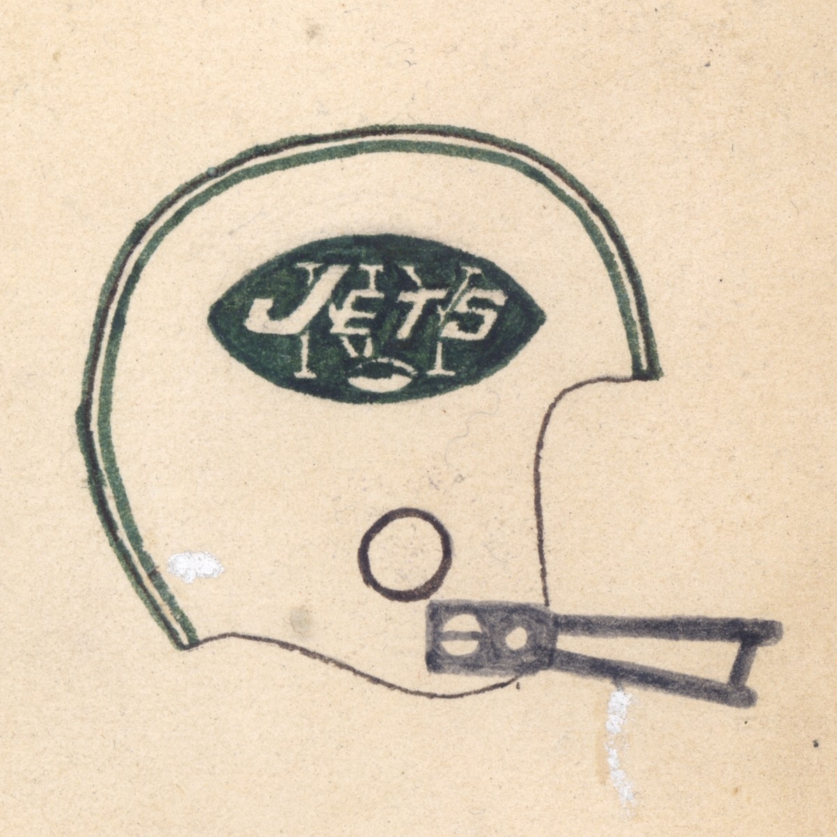
- New York Jets
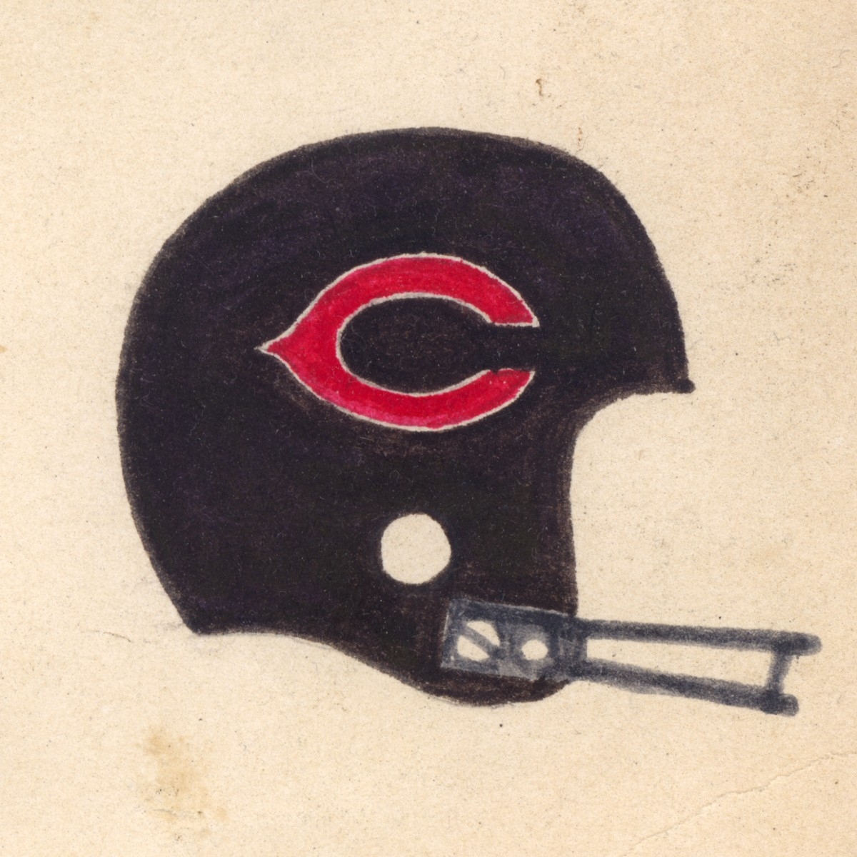
- Chicago Bears
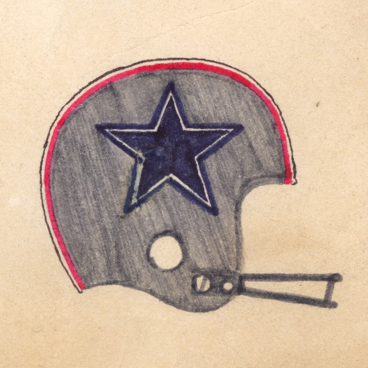
- Dallas Cowboys
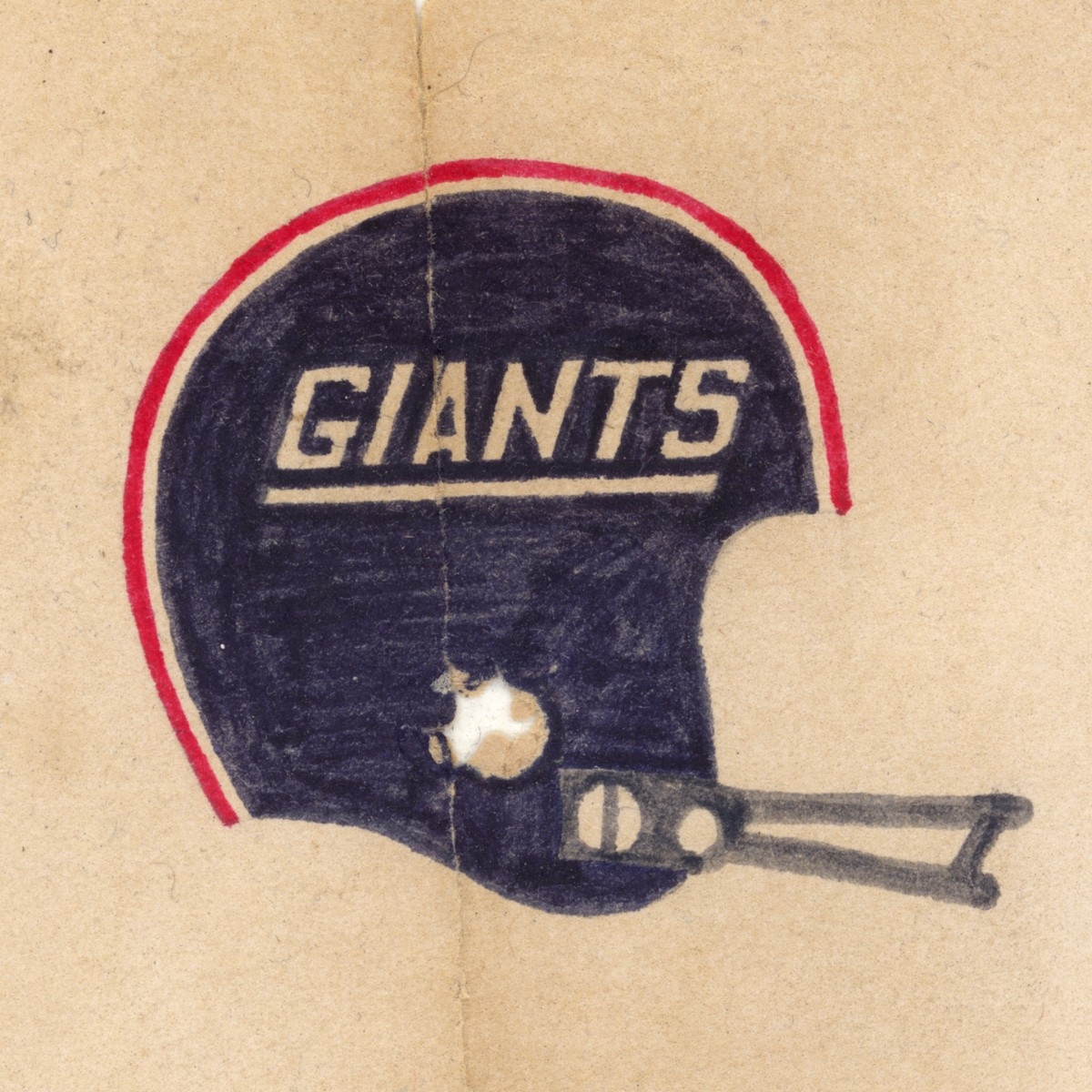
- New York Giants (went back to the NY logo that this one replaced)
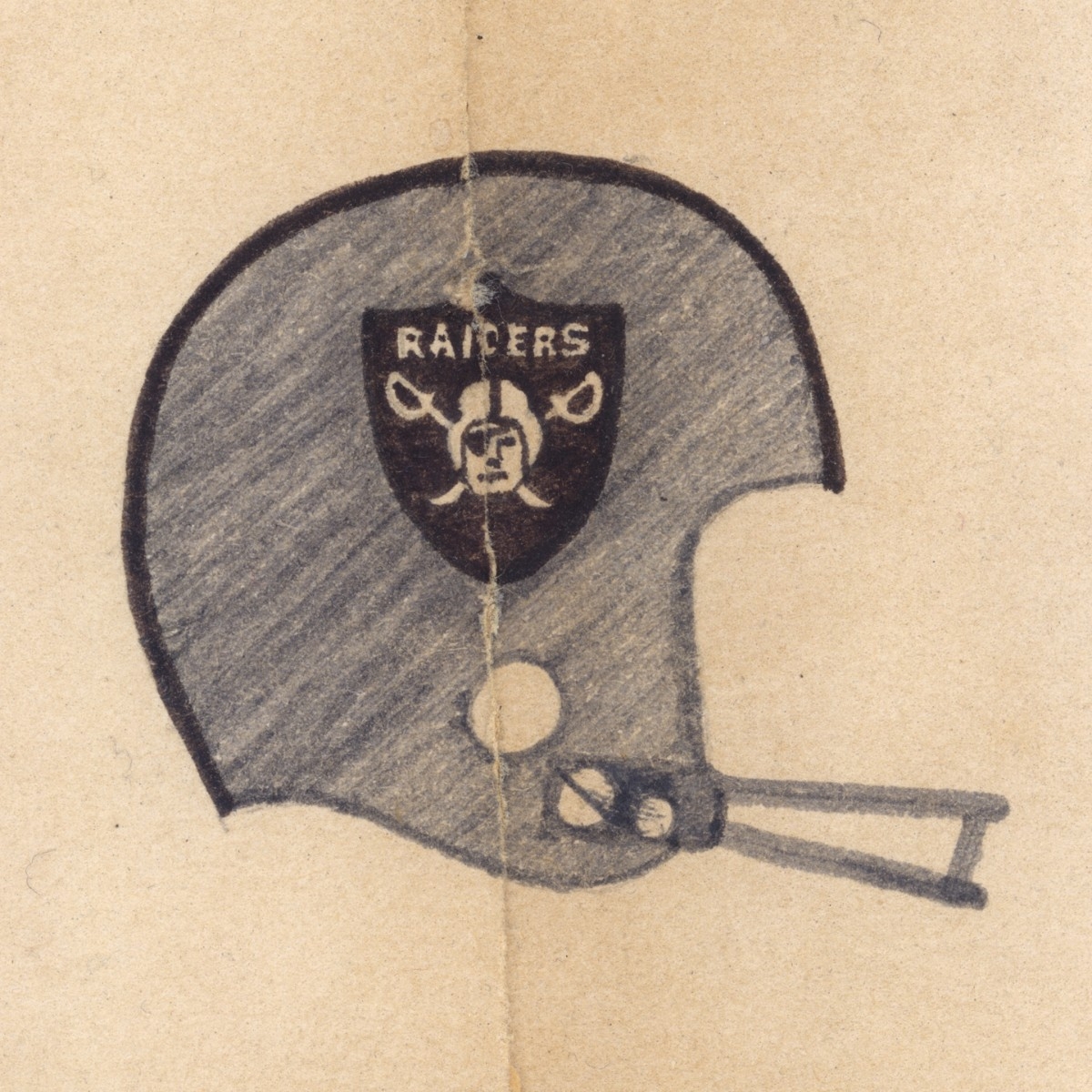
- Oakland Raiders
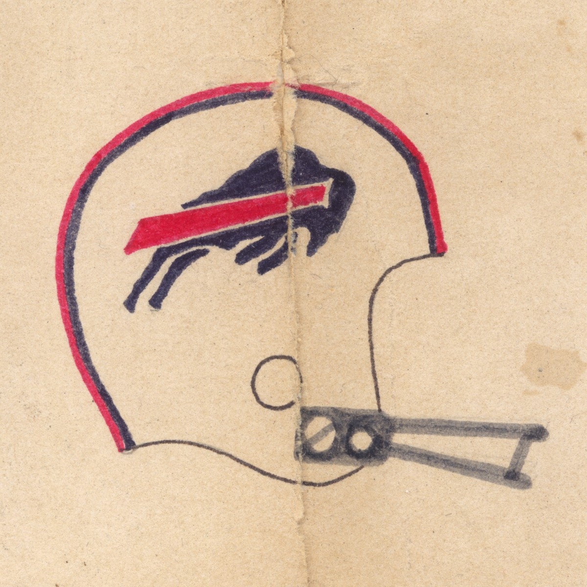
- Buffalo Bills
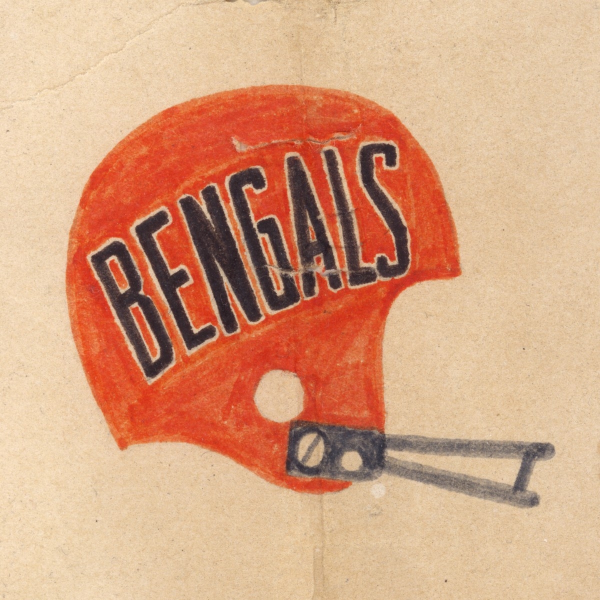
- Cincinnati Bengals
- New England Patriots (the WORST change ever!)
- Green Bay Packers
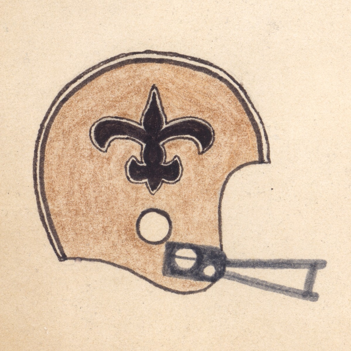
- New Orleans Saints
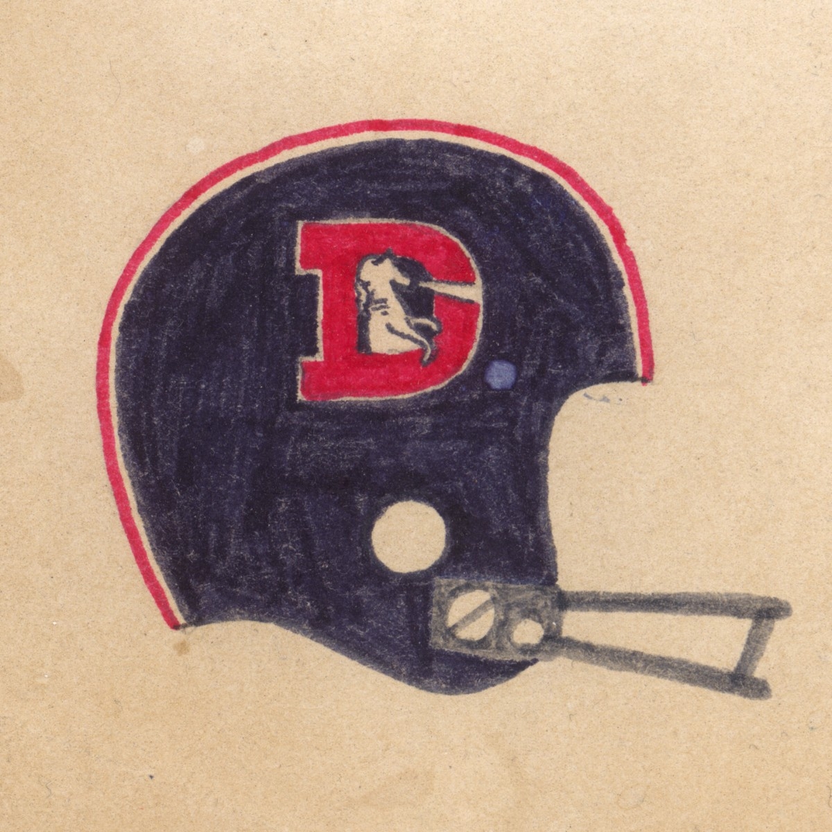
- Denver Broncos
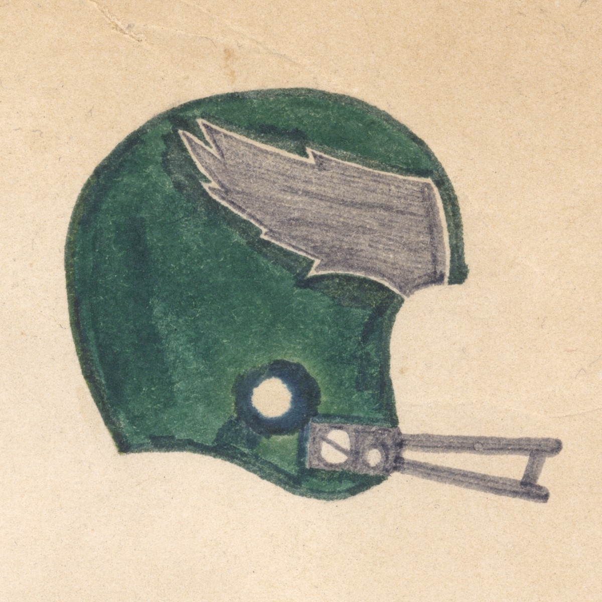
- Philadelphia Eagles
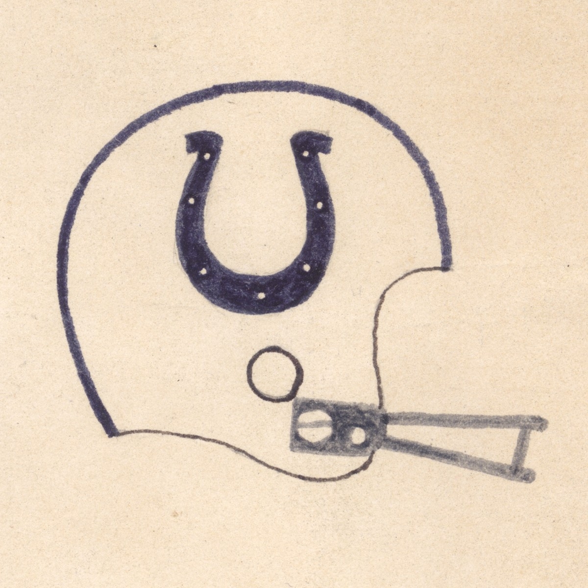
- Baltimore Colts (same helmets but now in Indianapolis)
- Pittsburgh Steelers
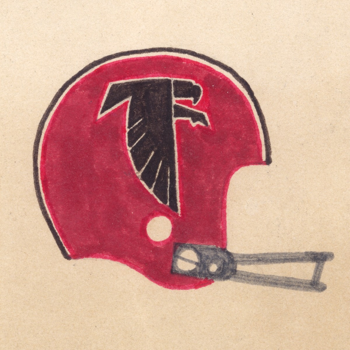
- Atlanta Falcons
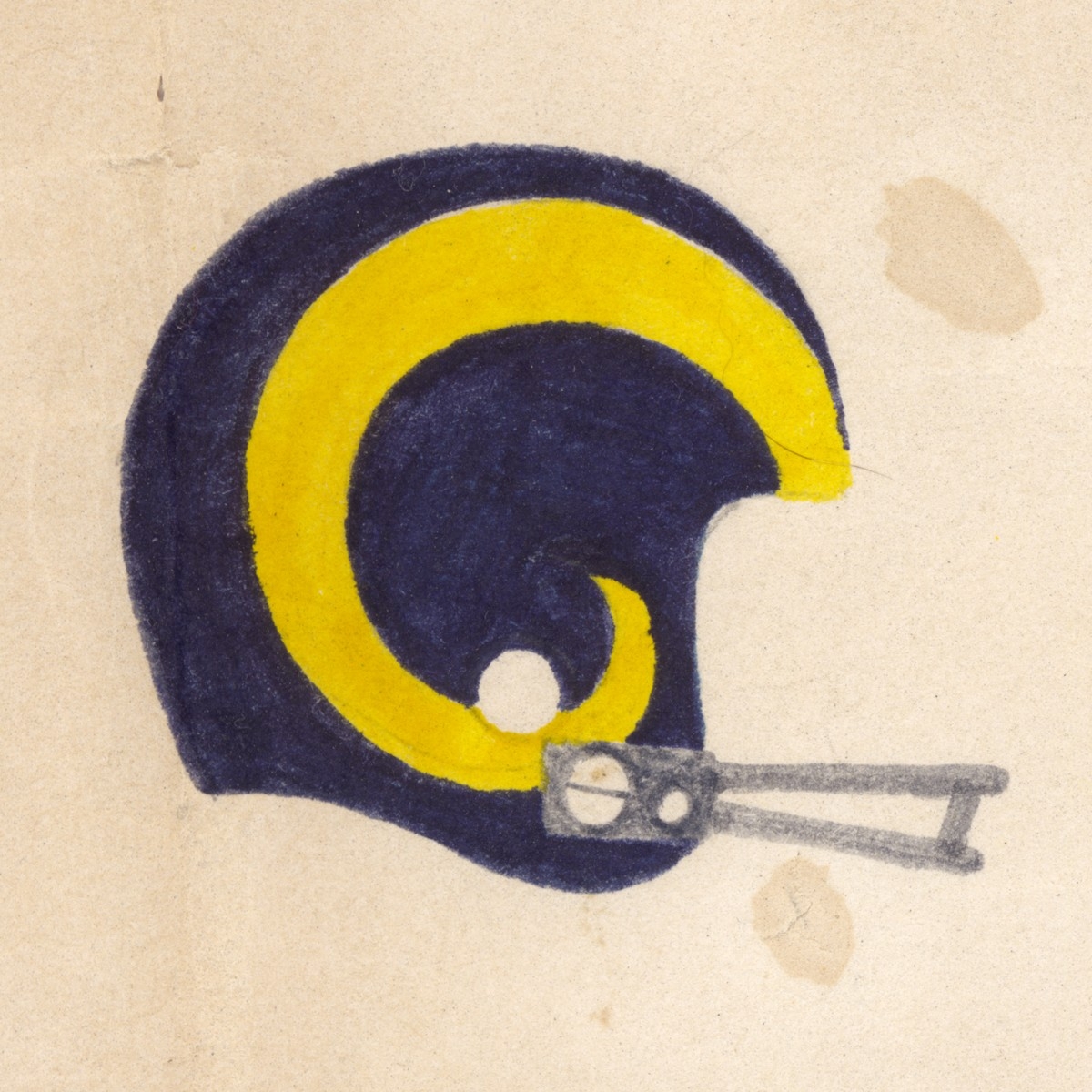
- Los Angeles Rams
- Detroit Lions
- Seattle Seahawks (same logo but several alternate helmet colors)
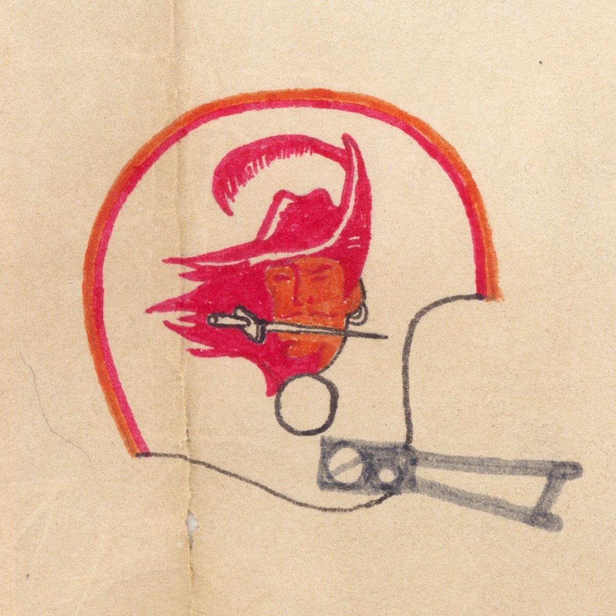
- Tampa Bay Buccaneers
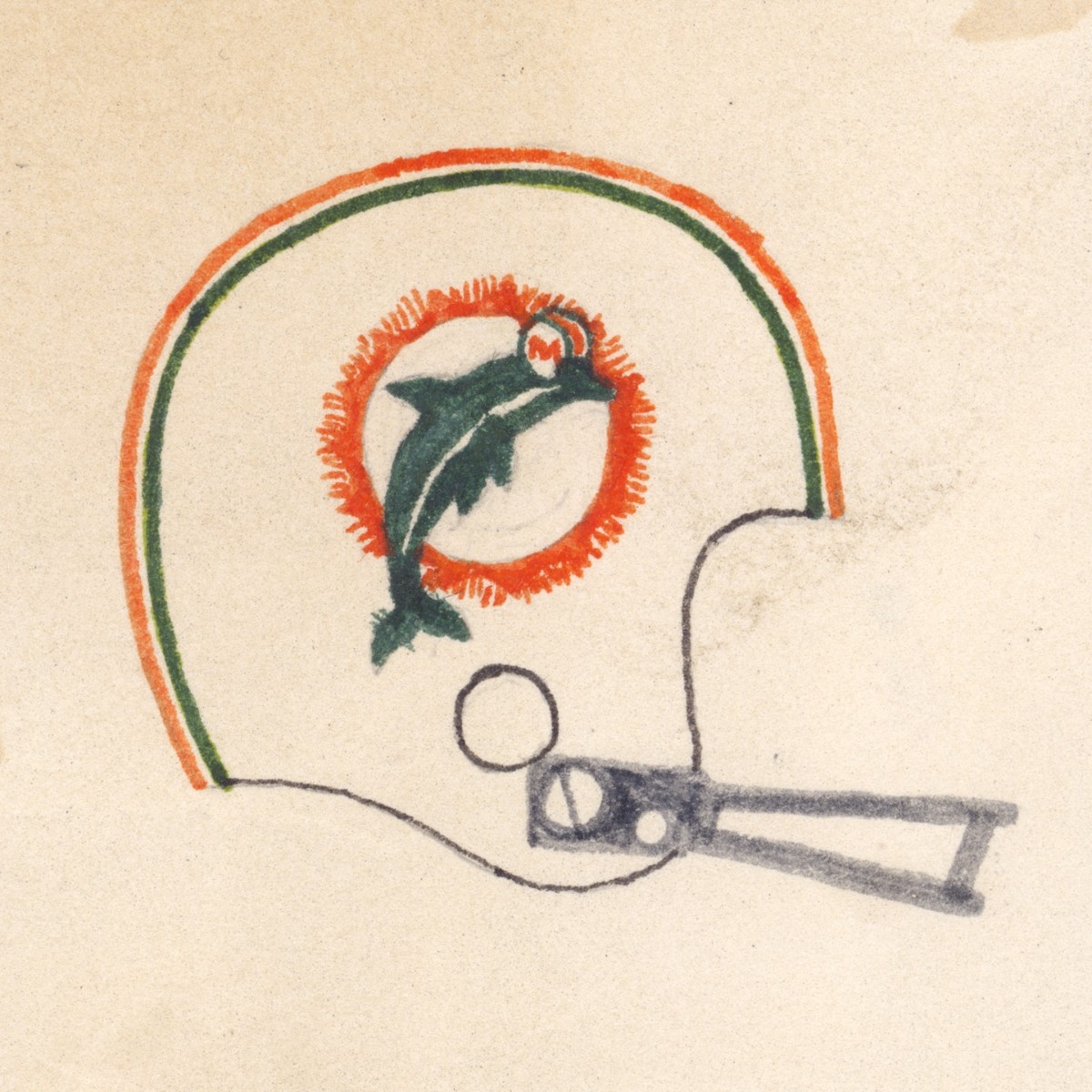
- Miami Dolphins
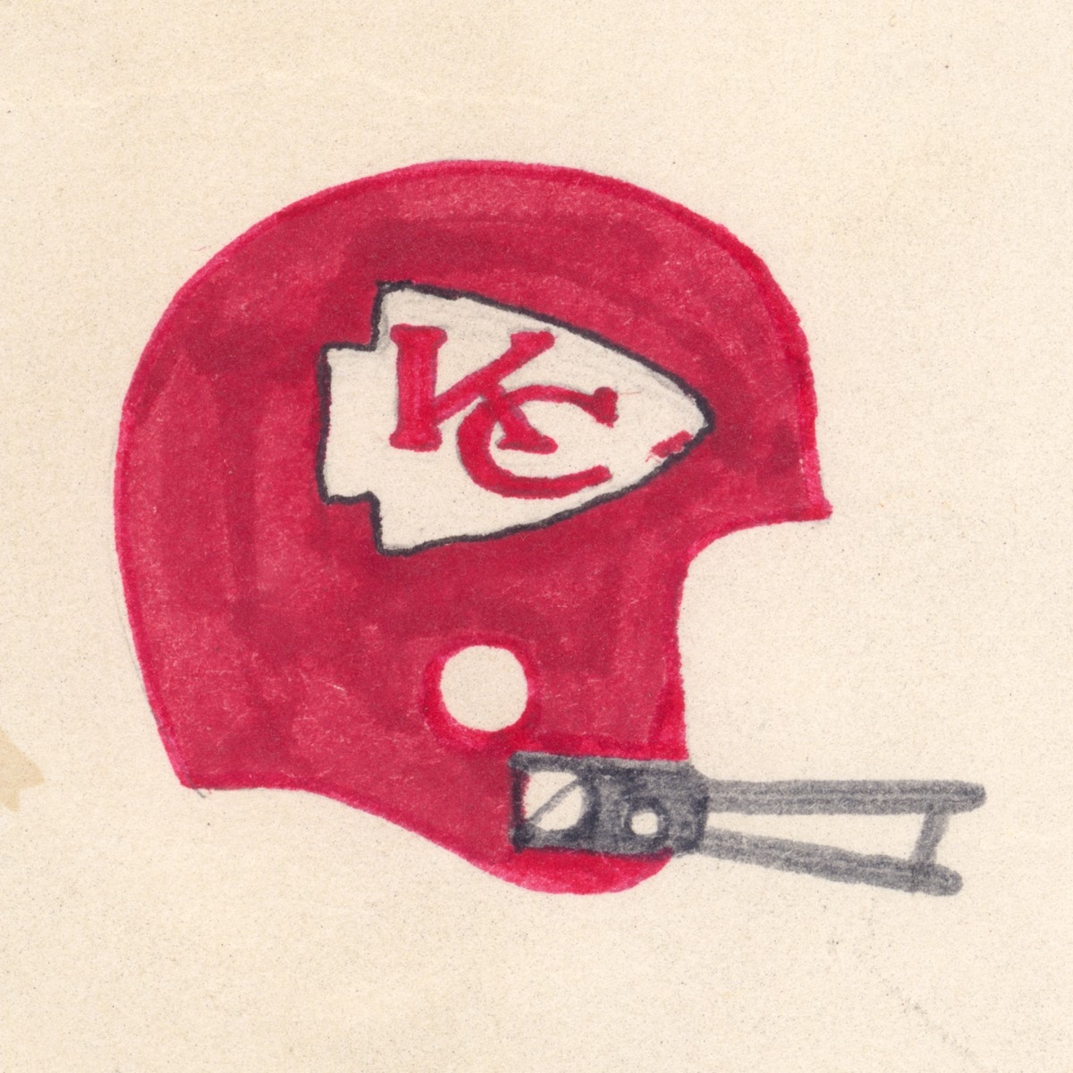
- Kansas City Chiefs
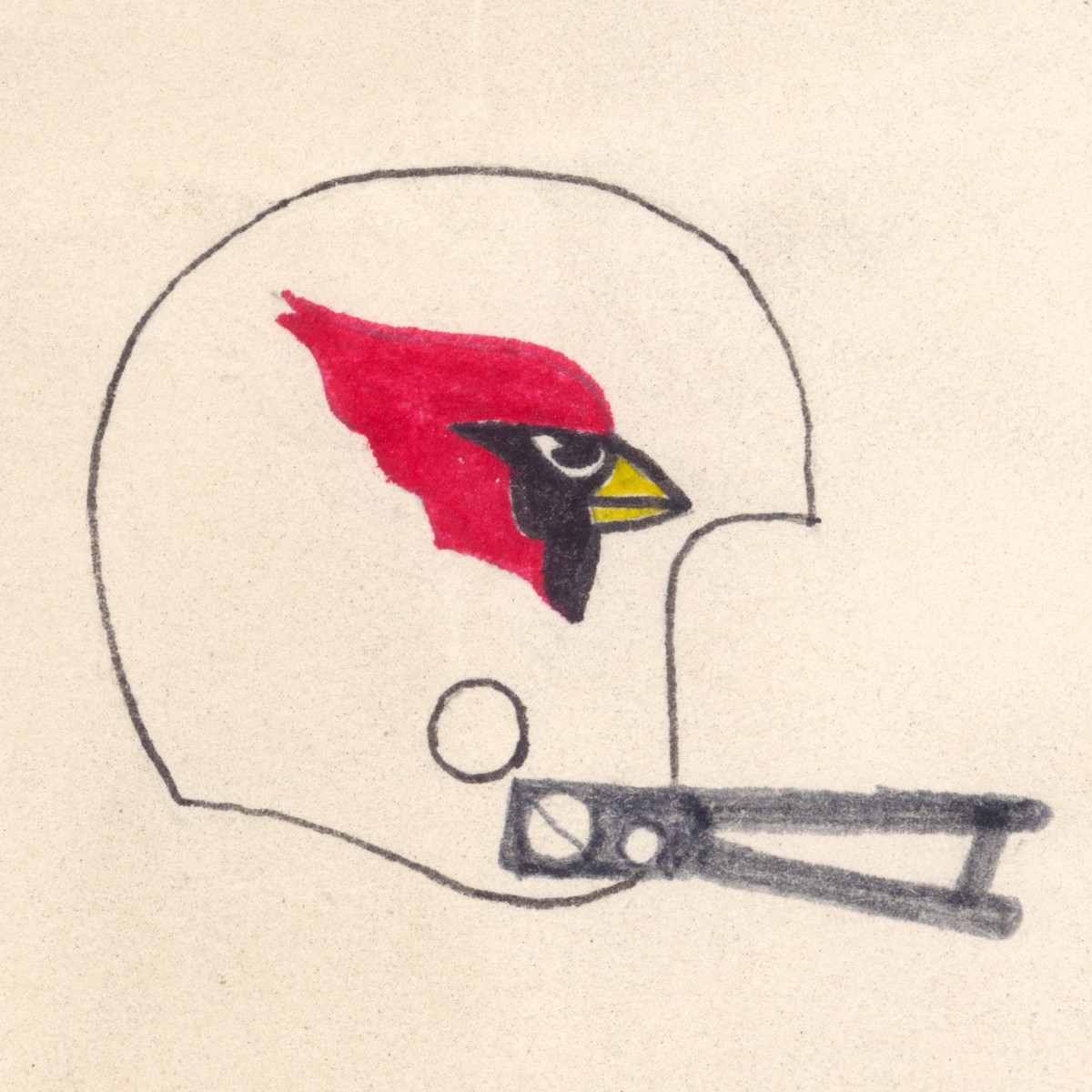
- St. Louis Cardinals (same helmets but now in Arizona)
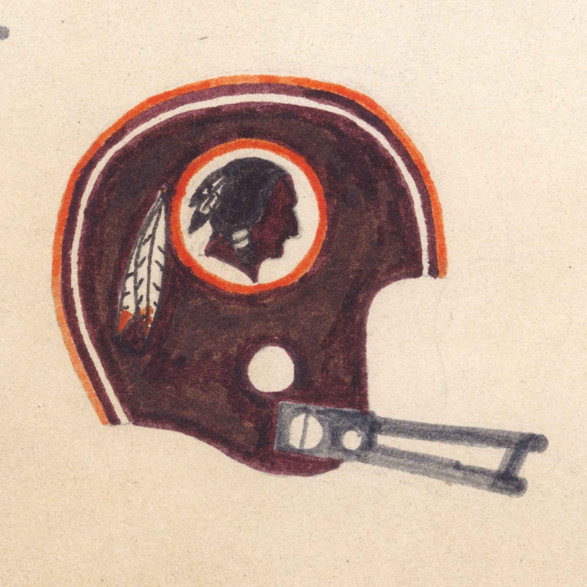
- Washington Redskins (not even the same name anymore)
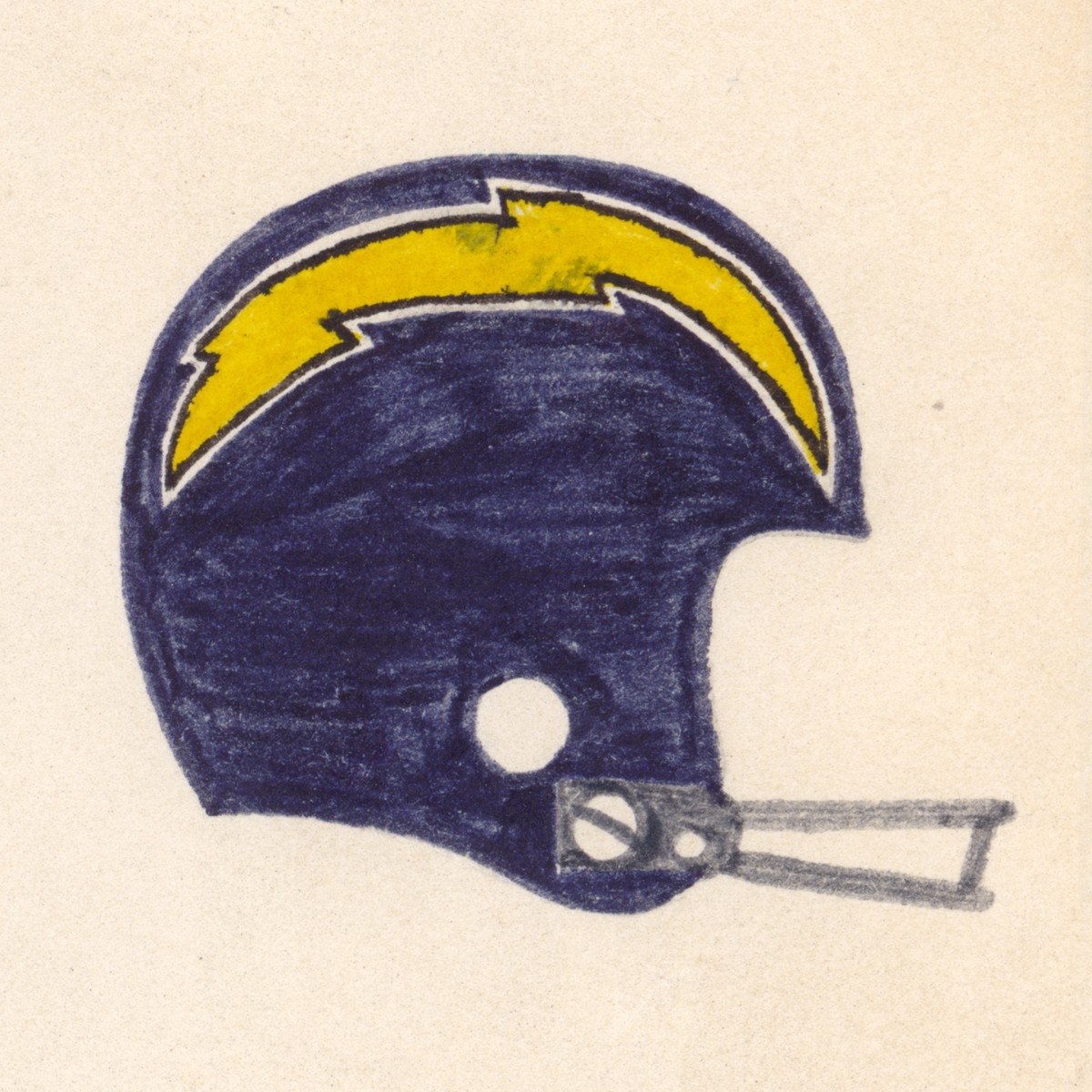
- San Diego Chargers (still pretty similar but now in LA)
- Houston Oilers (moved to Tennessee and became the Titans)
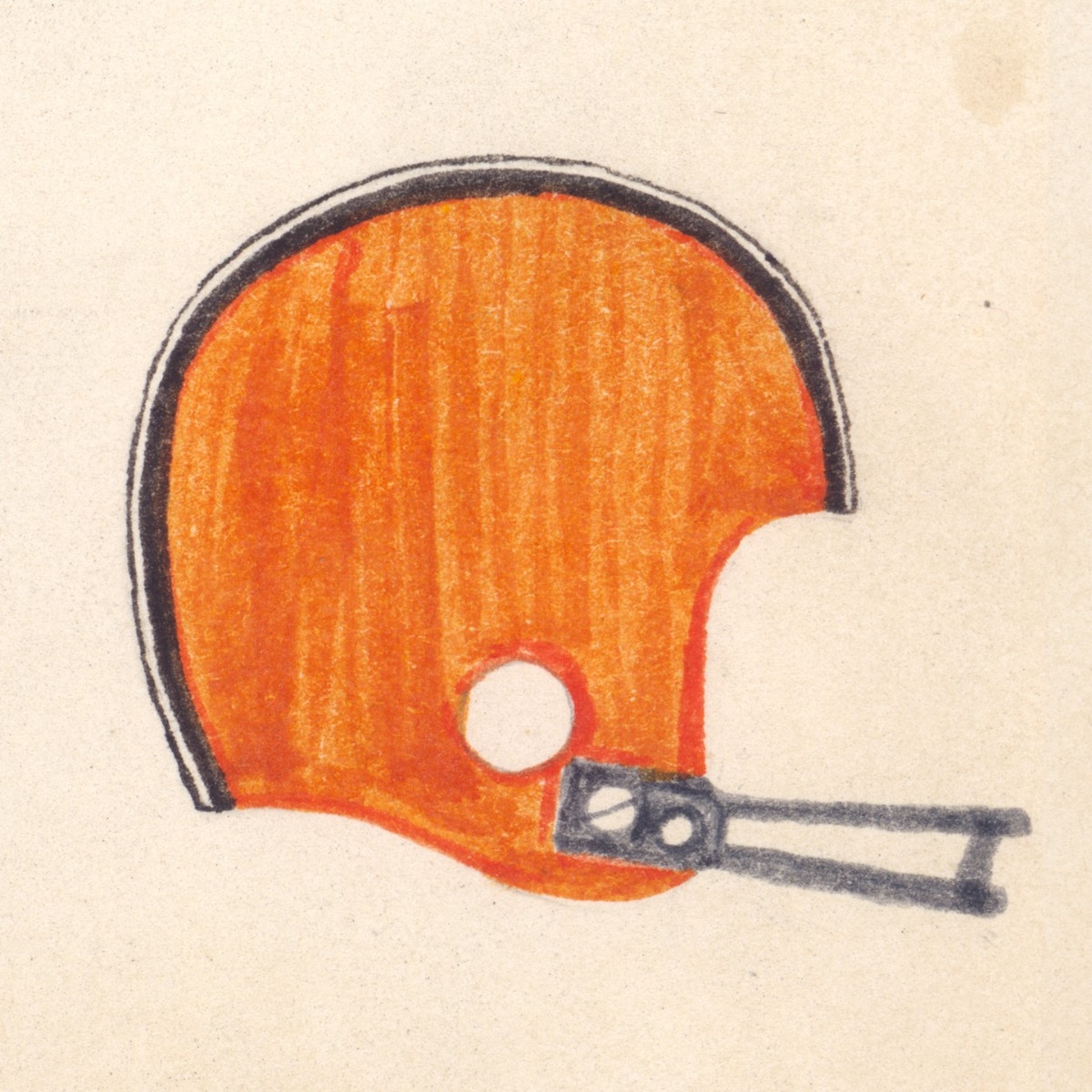
- Cleveland Browns
- Minnesota Vikings (OK pretty much the same anyhow)
Of course there are the alternate and throwback helmets, but that's a whole 'nuther story. Here's a great resource to investigate for yourself.
I have scanned the original and had prints made on an Epson photo printer using archival inks. Each print is hand signed by yours truly for authenticity. The image is 18x12in and the frames are 24x18in in black wood composite, with clear acrylic protecting the image and a solid brass plaque that reads "N.F.L. 1977". If you are interested in a different frame with glass instead of acrylic I can provide that too for an additional $50. Add another $30 for low reflection museum glass. If wall space is an issue I can even frame them in a 20x16in frame.
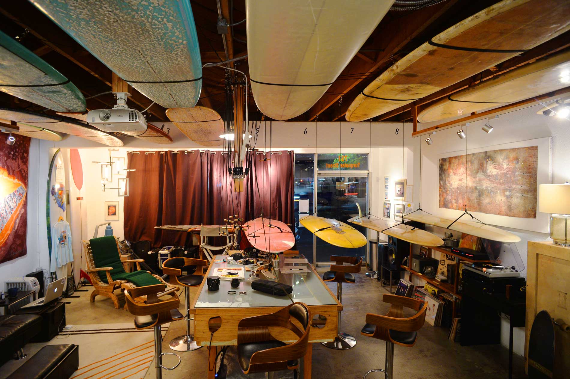
You can grab one for yourself in person at Beach Fuzz, or purcahse one on eBay to be shipped anywhere in the USA!
Purchase on eBay
Click/tap for full screen slideshow:
Mounted print in black frame
Detail of mounted print in black frame
The original drawing, not for sale!
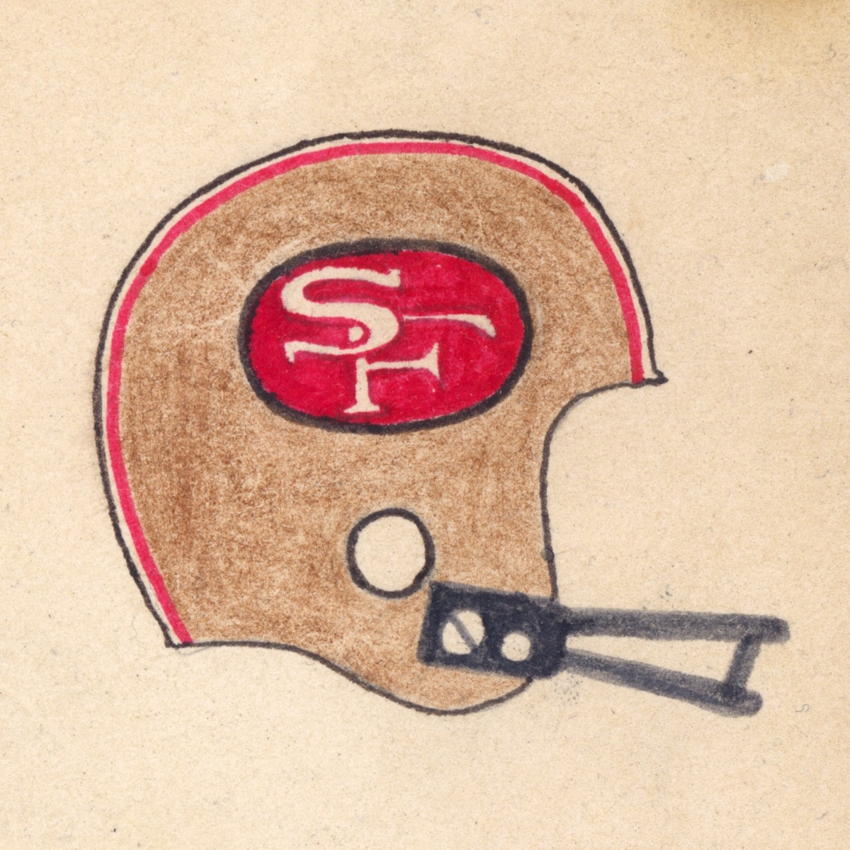
The 49ers helmet came out great, but the interlocking white letters were a real pain to do!
The Bears logo was pretty straightforward and I'm really happy with it!
The old 'BENGALS' logo was no fun to draw or to look at!
The '70 Bills logo was pretty modern looking compared to the old plain red buffalo.
The original Broncos logo with the capital 'D' was a really tough one with all the detail in the horse figure!
What can you say about the Browns logo? It sure wasn't easy to get a plain orange background!
The first year for the Buccaneers was an 0-14 disaster, but their helmets sure were cool. Not easy to get the face to show with two such similar colors though!
The Cardinals logo was a simple classic that came out great!
I couldn't screw up my hometown Chargers logo considering how many times I drew it on PeeChee folders!
The Chiefs logo has one little "whoopsie", but still a timeless classic!
A single color logo like the Colts meant I could really pay attention to the shape and details.
For some reason I recall the Cowboys having white in their helmets back then.
Not that I was a Dolphins fan then, but I sure loved their logo and made sure to nail it!
The Eagles logo was deceptively simple and not easy to draw!
The Falcons helmet turned out to be one of my favorites to draw, and I am still stoked on how it came out!
This version with 'GIANTS' and the other version with just 'ny' in lower case were both technical challenges with the letters in negative white space.
Lots of white details in the Jets logo made it a real challenge despite being only one color.
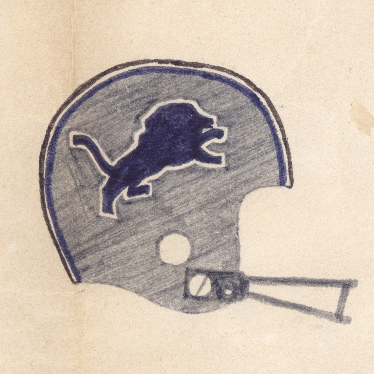
Silver was a hard color to pull off, but I'm really happy with how the Lions logo came out!
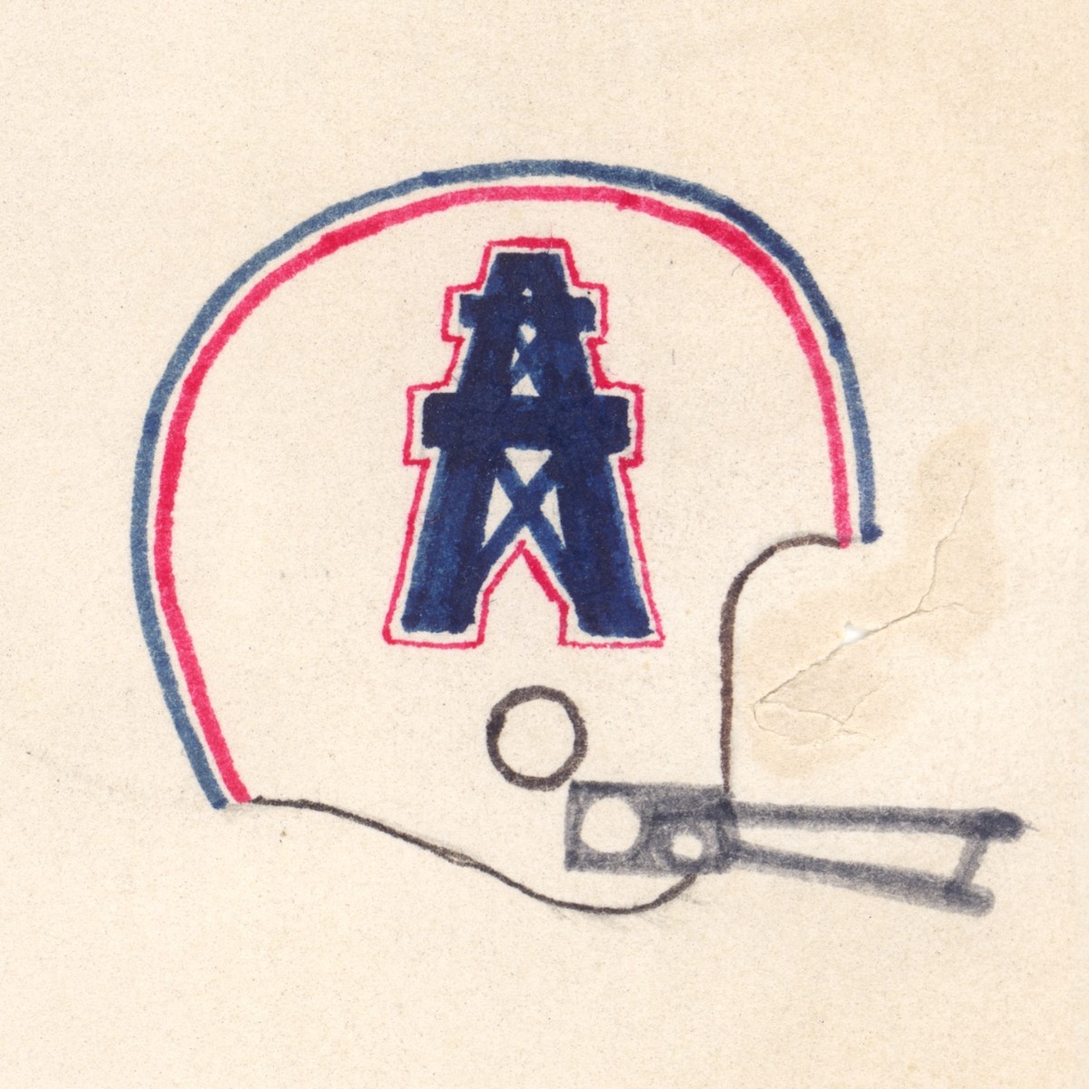
Ah yes, the old school Oilers. Not terribly difficult to draw, and definitely a long lost classic by now!
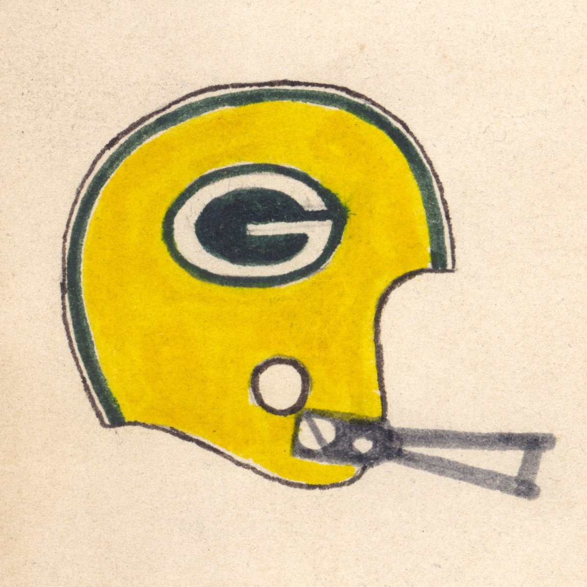
One of the oldest logos in the league was also quite difficult just because of the simple oval layout that would have been easy to mess up.
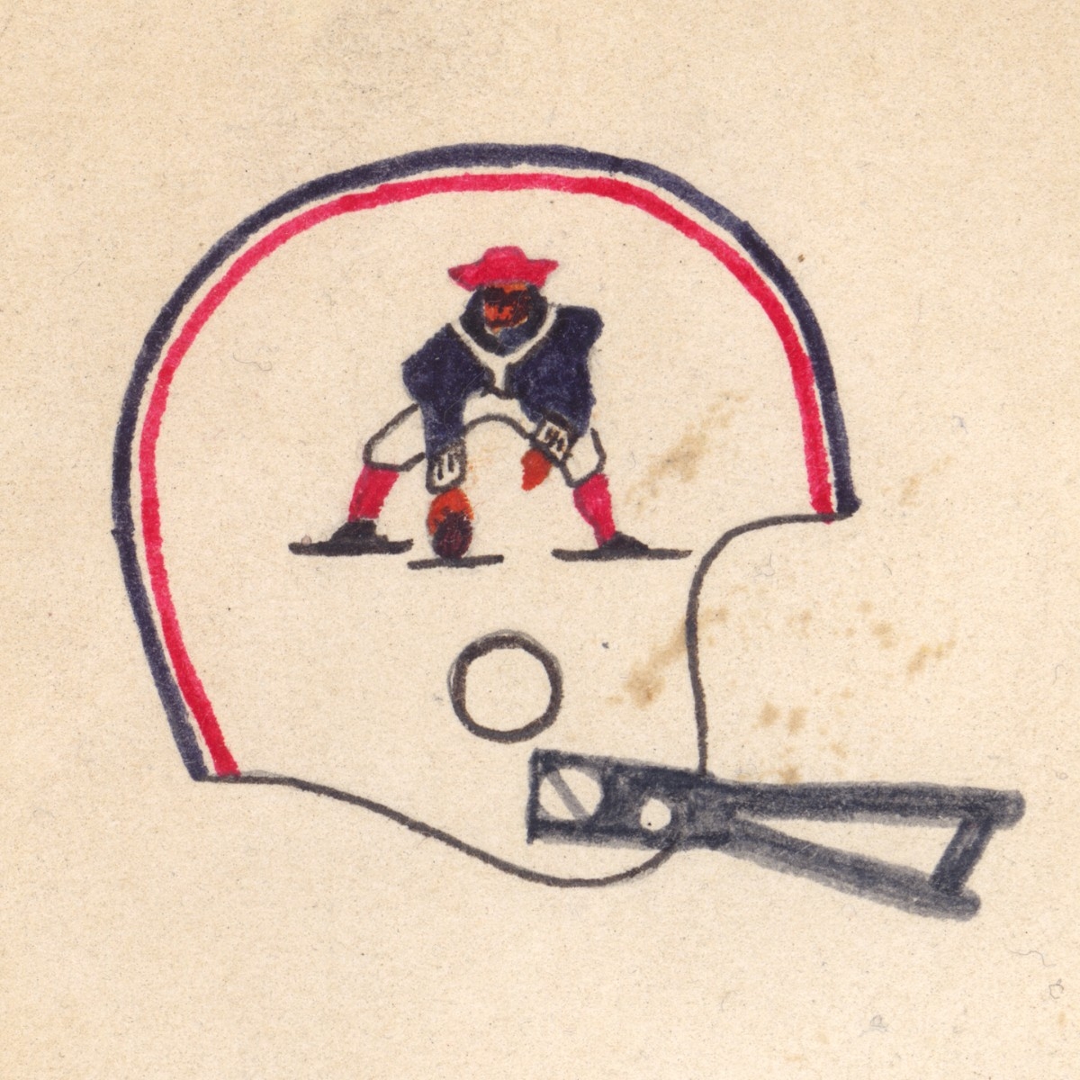
Who doesn't miss the original Patriots logo??? It' such a shame they didn't win the Super Bowl until long after they changed to the new logo.
As a Chargers fan I despised the Raiders, but that didn't stop me from nailing it!
With all those flowing curves the Rams logo was another simple looking one that was really hard to pull off.
What a shame the Redskins had to change their name and this classic logo! I remember putting a lot of time into this one!
The Saints were SO bad during this era that I made sure to nail the logo to make up for it!
As a first year team with a very unusual logo and colors that kind of blended together, the Seahawks helmet was another tough one to get right.
The Steelers were such a powerhouse back then that I really felt obligated to get this one right, and I think I nailed it!
My favorite NFC team back then was definitely the Vikings with their icicle beards and giant puffy parkas on the sidelines!